Okay, I'll chime in. I'm editor (and also occasional reviewer) of a long-lasting website devoted to iOS reviews. So, I've seen a lot already.
I would have loved to record a video showing where GoEye fails and makes bad UI choices, but GoEye hijacks iOS mirroring, so there's no way to record what the UI looks like without using an external camera, which is a sub-par solution. I have found no way to override this, so, no video. This hijacking is supposedly part of the AppleTV integration part, which I found nice in theory (I'm also one of the editors of the largest Apple TV-related blog,) but in practice not so good. The board is somewhat larger than what Qipan or SmartGo Kifu show in normal, iPad mirroring setting, but not by much, and there are no controls shown on-screen, instead the rest of the "screen real estate" is used by a QR code promoting the app.
Araban, having a browser for getting the games is a good point I think. It follows what Goodreader and Instapaper do: you no longer need to worry about remembering exactly where the file is, just browse without leaving the app and download from there. It's handy to have, even if not fundamental.
Here's another UI inconsistency. I'm using the black and white background with black/white circles, not stone images. This is what appears when I press delete:
I only like pictures for stones sparingly, for reviewing games or for editing I much prefer plain stones. Qipan does this perfectly, for instance. If I wanted good photorealistic stones, nothing would beat iGoban+ if it had a SGF editor.
If a dark gray background with black text (variations are shown in black text if they are named, comments in a slightly grey tinted white, same for coordinates for the stones) is supposed to be a good UI choice, we are all doomed. Doomed, I say.
Funny how the author criticises the "Reply" (sic, supposed to be Replay) in the SmartGo Kifu as an inconsistency. GoEye uses an icon expected for textual menus for the editing tools. Can't say how many times I've tapped the book view icon instead.
Also, if you look below you'll see that the icons for advance and go back are plus and minus signs, also violating standard UI/UX practices.
The author is also constantly using the phrase "Go Eye is the BEST and next generation of SGF editor." And I'm still wondering what is supposed to be the previous edition of SGF editor, specially for iOS:
- In GoEye I need to tap the delete icon to delete any stone I have placed. So, if I realise I'm slightly misplacing the problem one column to the left, I need to tap the delete icon as many times as stones I have. In both EasyGo and SmartGo, the adding stones mode also deletes previously positioned stones, removing any unnecessary taps
- If I'm creating a variation where white moves first (to show what happens if black tenuki) and then I try to get a black move in the same place as the black move, the app won't let me. This is a bug shared with EasyGo, SmartGo does not let to choose who moves in editing mode (as far as I could tell.) So much for next generation?
- To add letters/markers to the board I need to tap four times (menu->flag->sign I want->place I want,) in EasyGo and SmartGo only thrice (menu->marker type->place)
- I have a set of pro 9x9 games where, sometimes, a no-named node appears in the middle of the game tree. When replaying (in SmartGo, EasyGo or Qipan), it means (usually) that the replay stops there as if it was endgame, then it can be continued. This kind of node can be easily deleted in EasyGo (is shown as a triangle in the game tree) In SmartGo it is shown as (for instance) 26-60 and can also be easily deleted by tapping the crossed variation icon. GoEye does not even show it in the variation tree. The culprit property is FG in the SGF standard.
Now, this is a screenshot from Explorer 3.3, created on 1990 for Mac Classic:
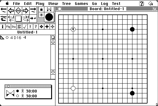
- Screen Shot 2014-08-06 at 09.40.00.jpg (75.34 KiB) Viewed 16292 times
It packs more tools in less space than most apps nowadays, sure (after all, a Mac Classic had 512x342 pixels screen.) And where and what are the editing tools?

Just click the stone to get a menu (so, 1 click to select, a scroll and another click for placement). And did you know? Even 24 years ago when adding stones, tapping an added stone deletes it.
Finally, I've seen the developer suggest in "his" thread to just purchase the app and, if you don't like it, request an Apple chargeback. Please, DON'T do this, as a user. There's no guarantee Apple will grant the refund (in general you need to have a decent proof of false advertising or app not working as advertised.) It should be the developer's duty to offer a free, lite version for you to try. EasyGo has EasyGo Lite, SmartGo doesn't have any, though.
For 15 USD I would never recommend GoEye, since the competition, even if small, outperforms in key aspects. For 5 USD more you can have SmartGo, with its 80k (offline available, anywhere you are) pro games, a very good range of problems and a relatively decent computer opponent (and better controls as detailed above.) For 3 USD less you can have EasyGo, which even if it has a very clunky interface, has very good controls for editing (specially for editing) and an incredibly good system for problems (study mode, spaced-repetition mode, lots of randomisation, etc.) So, if pro games are your thing, I'd recommend SmartGo, if you prefer heavy editing and/or tsumego capabilities, EasyGo specially shines.